Elevating Pharmacist workflows in clinical healthcare platforms.
Healthcare SaaS platform for pharmacists
UX Designer and Researcher
2025
Pharmacists were navigating a system meant to help, but it was slowing them down instead. I redesigned Mendon Bridge, a healthcare platform for managing patient records, to reduce friction, enhance usability, and support real-time clinical decisions.

TIMELINE
1 Month
THE TEAM
Tejaswini (me) - Designer
Madhu Nair - PM
Padma - Developer
MY ROLE
Conducted remote usability testing with 2 pharmacists to observe workflows and gather feedback
Collaborated with the developer to understand system logic and identify real-time user challenges
Mapped user flows and pinpointed friction in patient data and encounter tracking
Proposed navigation improvements and UI refinements to align with pharmacist needs and PHA integration
STAKEHOLDERS
Pharmacists
——————————————————————————————————————————————————————————————————————————————————————————————————-
——————————————————-
———————————————————————————————————————————————————————————————————
——————————————————————————————————————————————————-
——————————————————————
TOOLS
Figma, FigJam, Notion, Zoom
the problem.
the problem.
the problem.
the problem.
the problem.

goal.
goal.
goal.
goal.
Redesigned Mendon Bridge into a pharmacist- friendly platform focused on:
Simplifying clinical workflows
Enhancing clarity and usability
Enabling faster, more confident decision-making
Seamless integration with external systems like PHA and AIMS
Focused on building a clear, intuitive interface to streamline encounter and diagnosis management
Prioritized safety and clarity, because in healthcare, design is about more than aesthetics
Aimed to fix the flow, reduce complexity, and support real users doing high-stakes work every day
research and discovery.
research and discovery.
research and discovery.
research and discovery.


design strategy and progress.
design strategy and progress.
design strategy and progress.
design strategy and progress.
I focused on improving clarity, flow, and usability across multiple touchpoints in the system:
1. Patient Registry
Grouped key information (diagnoses, encounters, reports) into organized panels with consistent hierarchy and clear navigation.
2. Patient Encounter & Add Flow
Redesigned encounter details to prioritize clarity and context. Grouped medications, diagnosis, and orders by patient-specific relevance. Created a clean “Add Encounter” modal to reduce task friction.
3. Standing Orders
Segmented community vs. individual orders to reduce cognitive load and help pharmacists determine eligibility faster.
4. Profile
Centralized all profile-related data into one structured, editable area.
what is wrong with the current design?
what is wrong with the current design?
what is wrong with the current design?
what is wrong with the current design?
what is wrong with the current design?
what is wrong with the current design?

No visual/Type Hierarchy
The lack of clear hierarchy makes it difficult for pharmacists to scan and prioritize critical information efficiently. Each patient record includes an encounter, diagnosis, patient-specific medications, a general medication list, and standing orders. However, the way these options are displayed makes them feel disconnected — as if they exist independently rather than being tied to a specific patient.

Simplifying the columns
1. The current column naming system is unnecessary long.
2. It contains excessive information for a record preview, making it difficult to quickly identify or locate a patient at a glance.
Simplifying the columns
1. The current column naming system is unnecessary long.
2. It contains excessive information for a record preview, making it difficult to quickly identify or locate a patient at a glance.
Simplifying the columns
1. The current column naming system is unnecessary long.
2. It contains excessive information for a record preview, making it difficult to quickly identify or locate a patient at a glance.
Simplifying the columns
1. The current column naming system is unnecessary long.
2. It contains excessive information for a record preview, making it difficult to quickly identify or locate a patient at a glance.
Simplifying the columns
1. The current column naming system is unnecessary long.
2. It contains excessive information for a record preview, making it difficult to quickly identify or locate a patient at a glance.
Simplifying the columns
1. The current column naming system is unnecessary long.
2. It contains excessive information for a record preview, making it difficult to quickly identify or locate a patient at a glance.

No Clear User flow
The absence of a structured flow disrupts navigation, increasing cognitive load and inefficiency.
No Clear User flow
The absence of a structured flow disrupts navigation, increasing cognitive load and inefficiency.
No Clear User flow
The absence of a structured flow disrupts navigation, increasing cognitive load and inefficiency.
No Clear User flow
The absence of a structured flow disrupts navigation, increasing cognitive load and inefficiency.
No Clear User flow
The absence of a structured flow disrupts navigation, increasing cognitive load and inefficiency.
No Clear User flow
The absence of a structured flow disrupts navigation, increasing cognitive load and inefficiency.


No Grouping of elements
Related information is scattered, leading to confusion and a disorganized user experience. Too much and unnecessary information is presented. Excessive data overloads users, making it challenging to focus on essential details.
No Grouping of elements
Related information is scattered, leading to confusion and a disorganized user experience. Too much and unnecessary information is presented. Excessive data overloads users, making it challenging to focus on essential details.
No Grouping of elements
Related information is scattered, leading to confusion and a disorganized user experience. Too much and unnecessary information is presented. Excessive data overloads users, making it challenging to focus on essential details.
No Grouping of elements
Related information is scattered, leading to confusion and a disorganized user experience. Too much and unnecessary information is presented. Excessive data overloads users, making it challenging to focus on essential details.
No Grouping of elements
Related information is scattered, leading to confusion and a disorganized user experience. Too much and unnecessary information is presented. Excessive data overloads users, making it challenging to focus on essential details.
No Grouping of elements
Related information is scattered, leading to confusion and a disorganized user experience. Too much and unnecessary information is presented. Excessive data overloads users, making it challenging to focus on essential details.

the redesign.
the redesign.
the redesign.
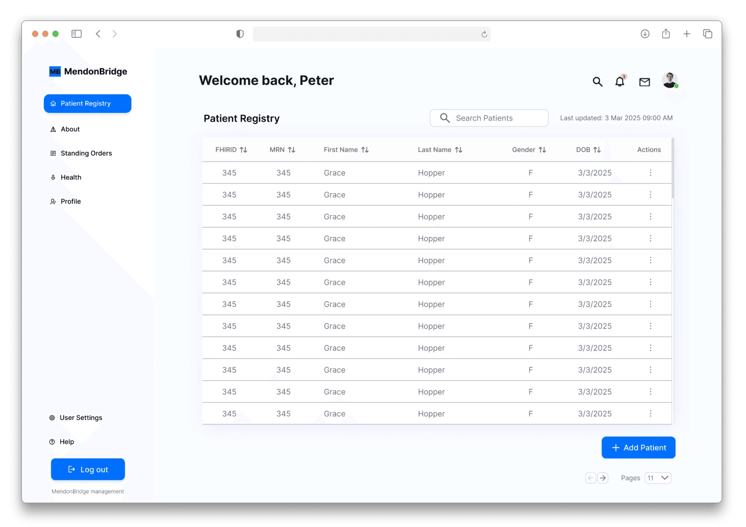
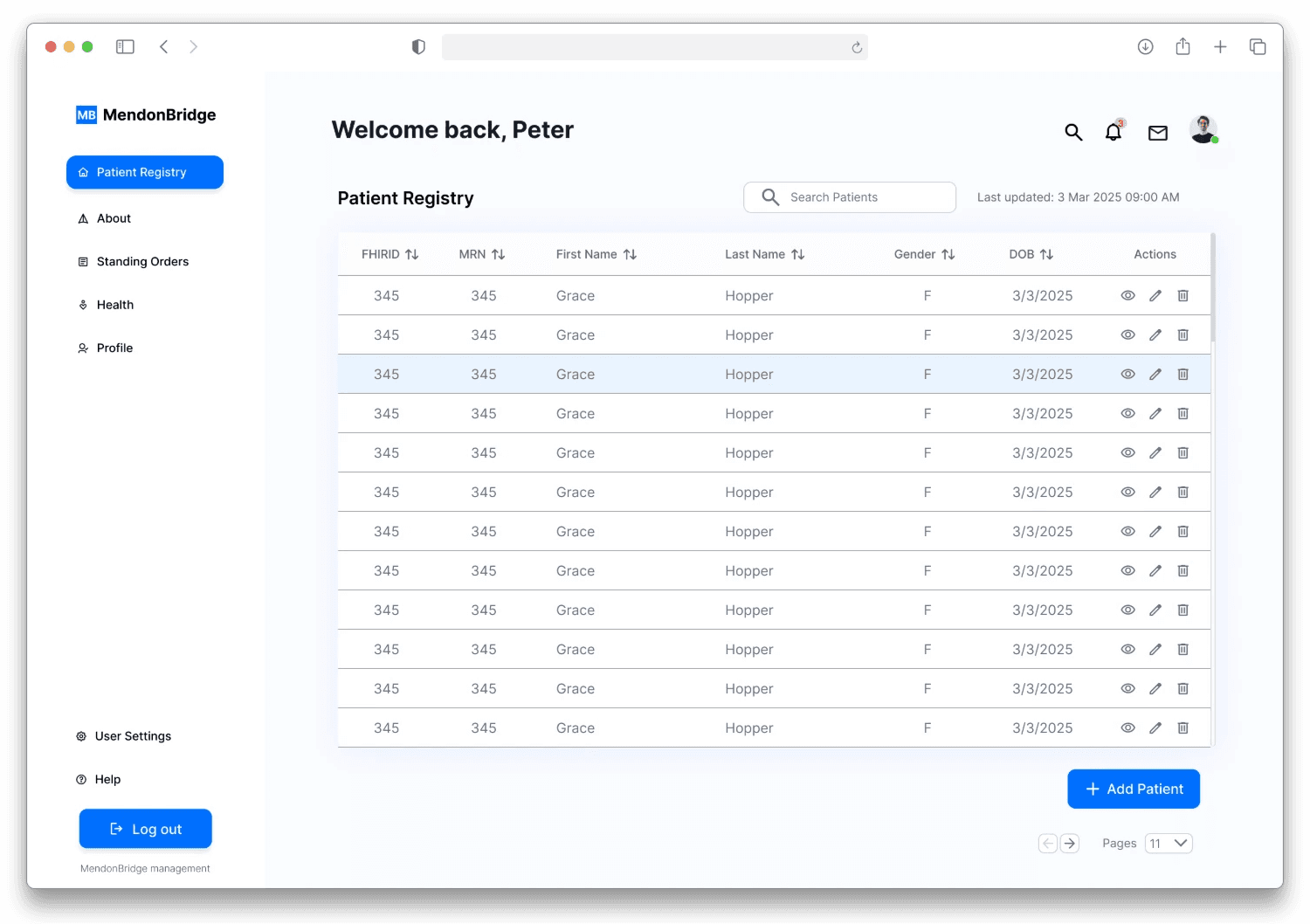
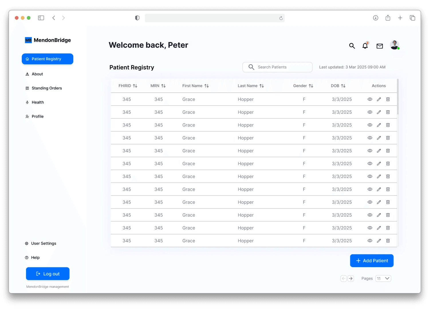
patient registry.
The patient registry maintains a consistent hierarchy, presenting a comprehensive list of patients in a structured table, with well-grouped elements, a clear navigation bar, and an organized side panel for improved usability. Each patient record contains key details such as diagnosis reports, encounter history, and related medical information.
The patient registry maintains a consistent hierarchy, presenting a comprehensive list of patients in a structured table, with well-grouped elements, a clear navigation bar, and an organized side panel for improved usability. Each patient record contains key details such as diagnosis reports, encounter history, and related medical information.
The patient registry maintains a consistent hierarchy, presenting a comprehensive list of patients in a structured table, with well-grouped elements, a clear navigation bar, and an organized side panel for improved usability. Each patient record contains key details such as diagnosis reports, encounter history, and related medical information.
the redesign.
the redesign.
the redesign.
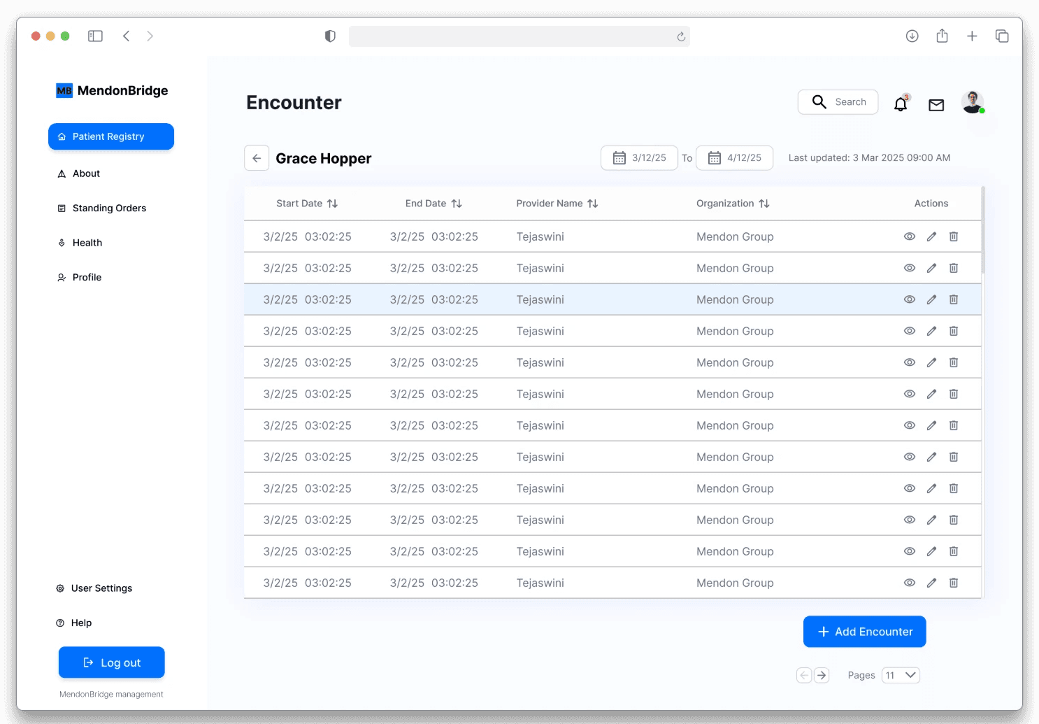
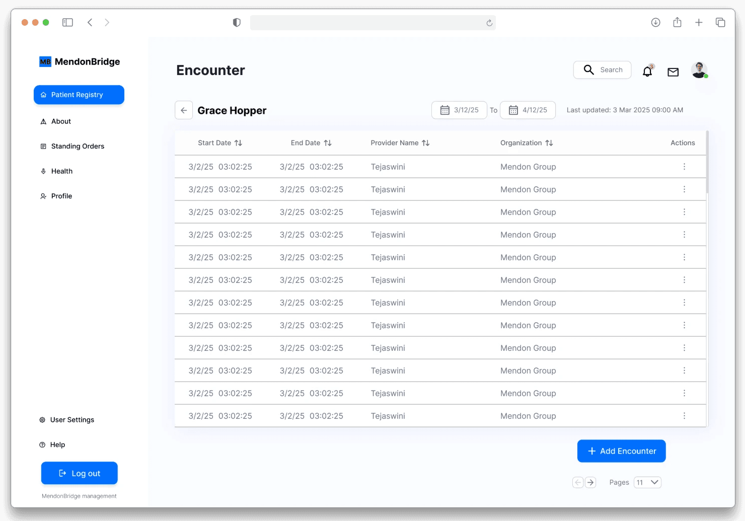
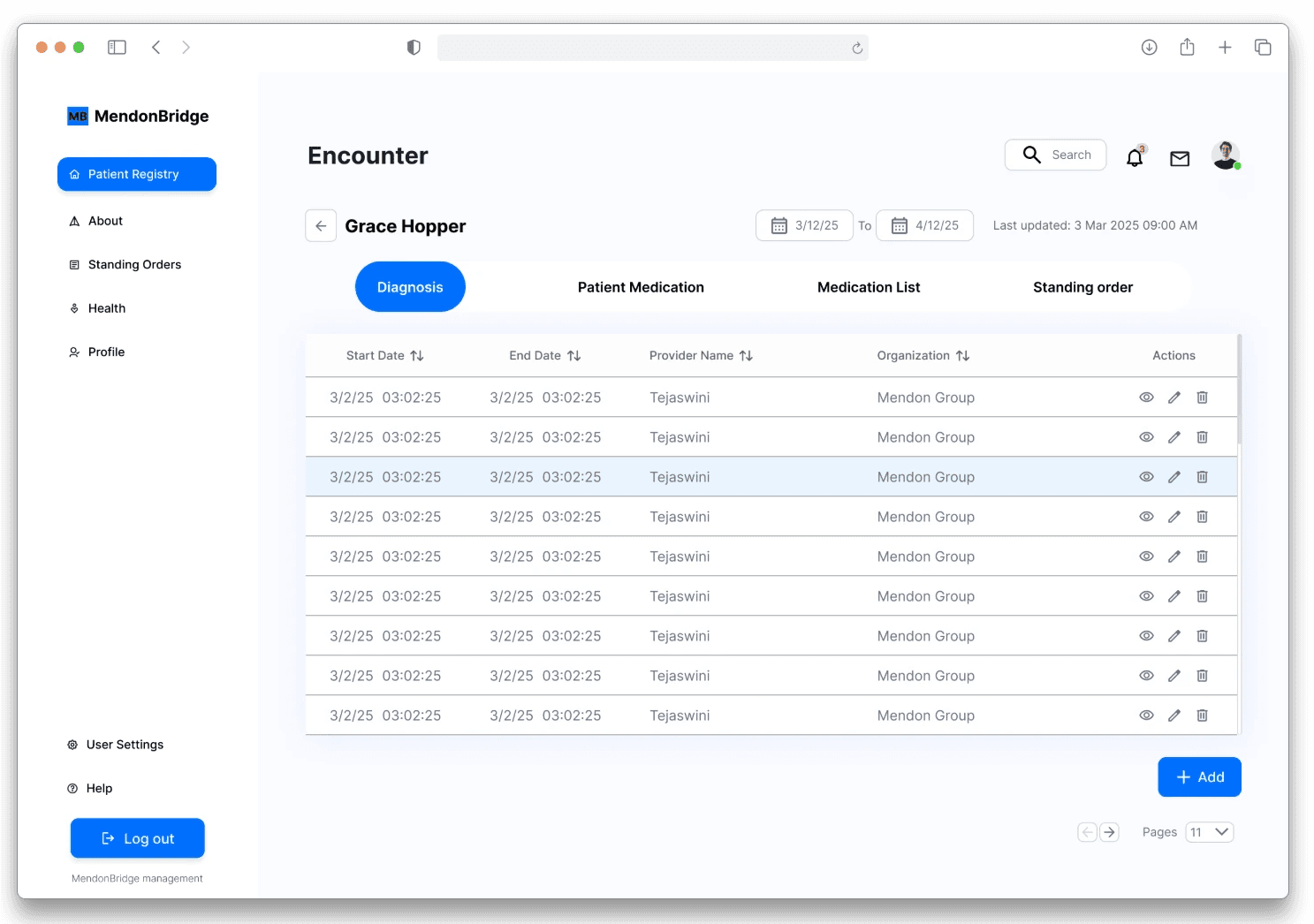
patient encounter.
This page presents a sophisticated list of encounters related to a specific patient, clearly communicating the hierarchy of information.
This page presents a sophisticated list of encounters related to a specific patient, clearly communicating the hierarchy of information.
This page presents a sophisticated list of encounters related to a specific patient, clearly communicating the hierarchy of information.


the redesign.
the redesign.
the redesign.
add patient encounter.
This pop up allows the pharmacist to add a new encounter. It also organizes the available options into groups for easier navigation.
This pop up allows the pharmacist to add a new encounter. It also organizes the available options into groups for easier navigation.
This pop up allows the pharmacist to add a new encounter. It also organizes the available options into groups for easier navigation.
the redesign.
the redesign.
the redesign.
patient encounter details.
This page provides a clear view of the options within the encounter, including diagnosis, partner medications, medication list, and the standing orders.
This page provides a clear view of the options within the encounter, including diagnosis, partner medications, medication list, and the standing orders.
This page provides a clear view of the options within the encounter, including diagnosis, partner medications, medication list, and the standing orders.

why this redesign works?
why this redesign works?
why this redesign works?
why this redesign works?
why this redesign works?
The redesign works because it mirrors how pharmacists actually process information, with clear hierarchy, grouped elements, and streamlined navigation with clear flow of elements. It reduces cognitive load and enables faster decision-making, making it a scalable solution for any data-heavy, high-stakes platform.
The redesign works because it mirrors how pharmacists actually process information, with clear hierarchy, grouped elements, and streamlined navigation with clear flow of elements. It reduces cognitive load and enables faster decision-making, making it a scalable solution for any data-heavy, high-stakes platform.
The redesign works because it mirrors how pharmacists actually process information, with clear hierarchy, grouped elements, and streamlined navigation with clear flow of elements. It reduces cognitive load and enables faster decision-making, making it a scalable solution for any data-heavy, high-stakes platform.
the redesign.
the redesign.
the redesign.
dashboard navigation.
By grouping related information into a dedicated side panel, the interface now presents content in a structured, digestible way. This reduces visual clutter, improves context, and helps users focus on what matters most, streamlining their workflow and minimizing cognitive overload.
By grouping related information into a dedicated side panel, the interface now presents content in a structured, digestible way. This reduces visual clutter, improves context, and helps users focus on what matters most, streamlining their workflow and minimizing cognitive overload.
By grouping related information into a dedicated side panel, the interface now presents content in a structured, digestible way. This reduces visual clutter, improves context, and helps users focus on what matters most, streamlining their workflow and minimizing cognitive overload.


why this redesign works?
why this redesign works?
why this redesign works?
why this redesign works?
why this redesign works?
The redesign works because grouping related information in a side panel creates clarity, reduces cognitive load, and helps users focus on key tasks.
The redesign works because grouping related information in a side panel creates clarity, reduces cognitive load, and helps users focus on key tasks.
The redesign works because grouping related information in a side panel creates clarity, reduces cognitive load, and helps users focus on key tasks.


the redesign.
the redesign.
the redesign.
patient detail.
All columns were renamed for clarity, and each patient detail page now features well-organized input fields that support efficient pharmacist actions. Time-sensitive standing orders are clearly highlighted to enable faster, more informed decisions.
All columns were renamed for clarity, and each patient detail page now features well-organized input fields that support efficient pharmacist actions. Time-sensitive standing orders are clearly highlighted to enable faster, more informed decisions.
All columns were renamed for clarity, and each patient detail page now features well-organized input fields that support efficient pharmacist actions. Time-sensitive standing orders are clearly highlighted to enable faster, more informed decisions.
the redesign.
the redesign.
the redesign.
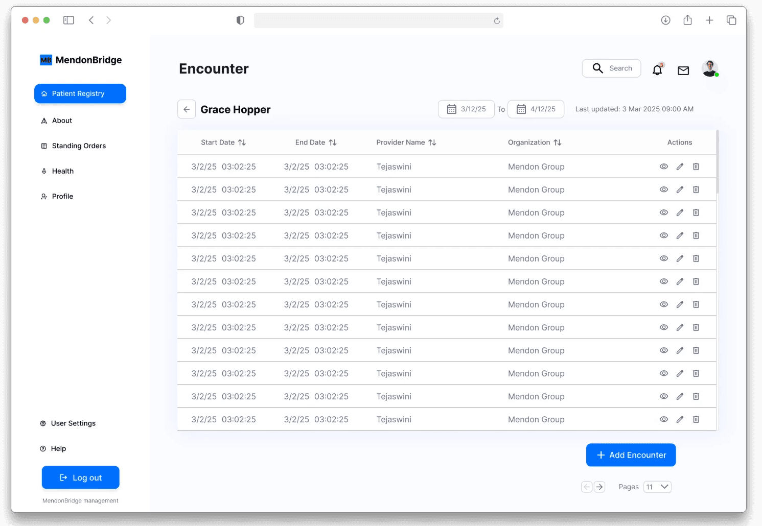
add patient.
In the new design, the “Add Patient” option is seamlessly integrated at the bottom of the records list, creating a more natural entry point and allowing pharmacists to add new records without breaking their workflow.
In the new design, the “Add Patient” option is seamlessly integrated at the bottom of the records list, creating a more natural entry point and allowing pharmacists to add new records without breaking their workflow.
In the new design, the “Add Patient” option is seamlessly integrated at the bottom of the records list, creating a more natural entry point and allowing pharmacists to add new records without breaking their workflow.


the redesign.
the redesign.
the redesign.
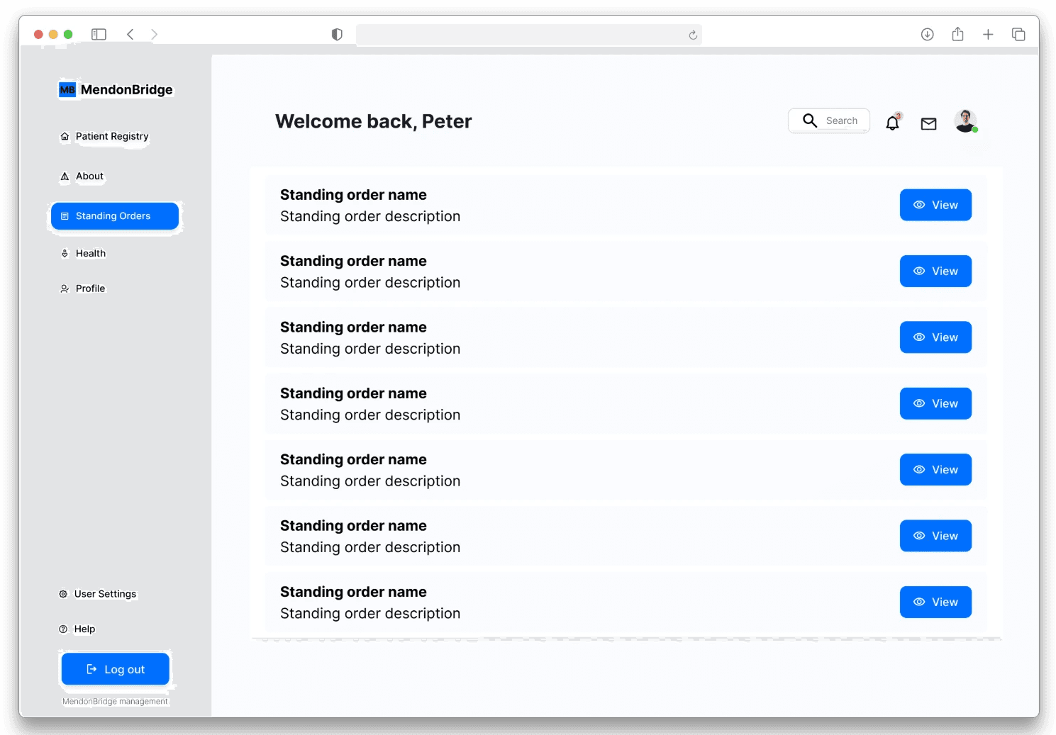
standing orders.
This page displays publicly issued standing orders, categorized into Community and Individual types. It focuses on Community Standing Orders, allowing pharmacists to review them and determine if a patient meets the criteria for any applicable orders.
This page displays publicly issued standing orders, categorized into Community and Individual types. It focuses on Community Standing Orders, allowing pharmacists to review them and determine if a patient meets the criteria for any applicable orders.
This page displays publicly issued standing orders, categorized into Community and Individual types. It focuses on Community Standing Orders, allowing pharmacists to review them and determine if a patient meets the criteria for any applicable orders.
the redesign.
the redesign.
the redesign.
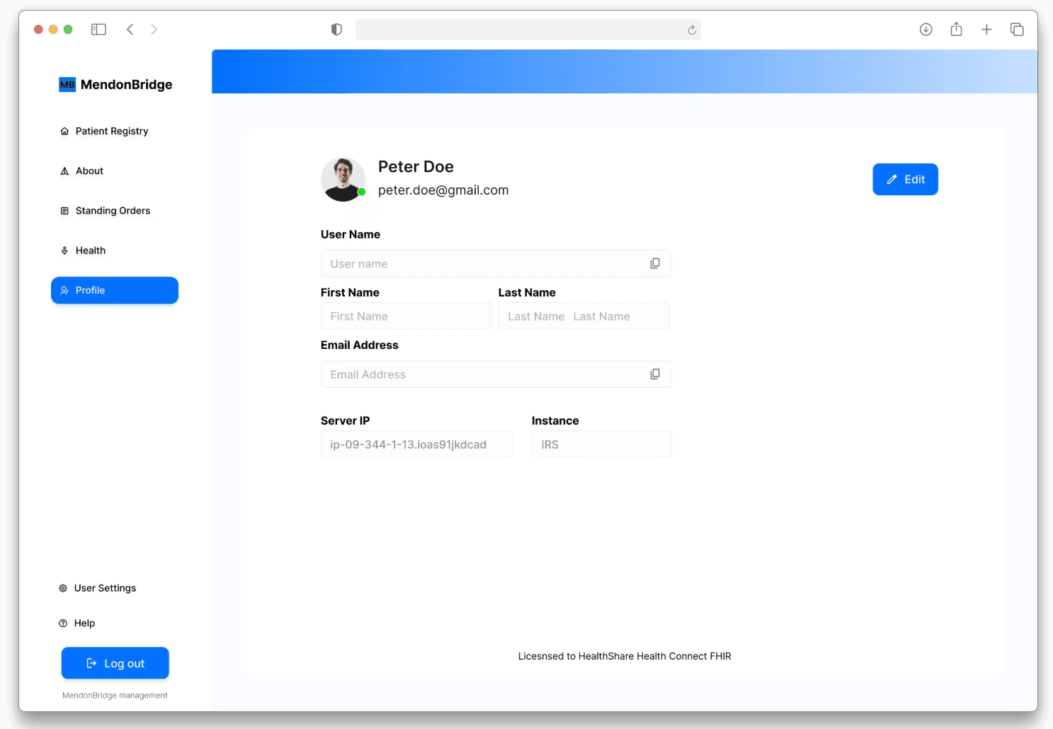
profile.
All profile-related information is grouped and organized within the profile section.
All profile-related information is grouped and organized within the profile section.
All profile-related information is grouped and organized within the profile section.

why this redesign works?
why this redesign works?
why this redesign works?
why this redesign works?
why this redesign works?
The redesign works because simplified column names and structured inputs make patient details instantly scannable, helping pharmacists act faster and with less effort. By placing the “Add Patient” option at the bottom of the records list, the design aligns with natural workflows, making the action more intuitive and reducing navigation friction.
The redesign works because simplified column names and structured inputs make patient details instantly scannable, helping pharmacists act faster and with less effort. By placing the “Add Patient” option at the bottom of the records list, the design aligns with natural workflows, making the action more intuitive and reducing navigation friction.
The redesign works because simplified column names and structured inputs make patient details instantly scannable, helping pharmacists act faster and with less effort. By placing the “Add Patient” option at the bottom of the records list, the design aligns with natural workflows, making the action more intuitive and reducing navigation friction.
I put early prototypes back in front of pharmacists. Their reactions:
“Now it makes sense.”
“It’s much easier to find what I need.”
Fewer questions, more confidence
Faster task completion
We iterated again, refining groupings, tweaking the layout, and polishing language.
I put early prototypes back in front of pharmacists. Their reactions:
“Now it makes sense.”
“It’s much easier to find what I need.”
Fewer questions, more confidence
Faster task completion
We iterated again, refining groupings, tweaking the layout, and polishing language.
I put early prototypes back in front of pharmacists. Their reactions:
“Now it makes sense.”
“It’s much easier to find what I need.”
Fewer questions, more confidence
Faster task completion
We iterated again, refining groupings, tweaking the layout, and polishing language.
testing & iteration.
testing & iteration.
testing & iteration.
testing & iteration.
testing & iteration.
early results.
early results.
early results.
early results.
early results.
While full deployment is was still in progress, initial feedback shows:
Clear improvement in navigation efficiency
Higher satisfaction among pharmacists
Better alignment between UI and how users actually think/work
While full deployment is was still in progress, initial feedback shows:
Clear improvement in navigation efficiency
Higher satisfaction among pharmacists
Better alignment between UI and how users actually think/work
While full deployment is was still in progress, initial feedback shows:
Clear improvement in navigation efficiency
Higher satisfaction among pharmacists
Better alignment between UI and how users actually think/work
TAKEAWAYS
TAKEAWAYS
TAKEAWAYS
/Ownership
/Ownership
/Ownership
As the lead designer on the UX redesign project, I guided the vision and strategy, ensuring every design decision aligned with user needs while maintaining consistency and innovation across the platform.
As the lead designer on the UX redesign project, I guided the vision and strategy, ensuring every design decision aligned with user needs while maintaining consistency and innovation across the platform.
As the lead designer on the UX redesign project, I guided the vision and strategy, ensuring every design decision aligned with user needs while maintaining consistency and innovation across the platform.
/Fast-paced
/Fast-paced
/Fast-paced
The fast-paced nature of the redesign taught me to be adaptable and resourceful, allowing me to iterate quickly, manage shifting priorities, and deliver results without compromising quality.
The fast-paced nature of the redesign taught me to be adaptable and resourceful, allowing me to iterate quickly, manage shifting priorities, and deliver results without compromising quality.
The fast-paced nature of the redesign taught me to be adaptable and resourceful, allowing me to iterate quickly, manage shifting priorities, and deliver results without compromising quality.
/Results
/Results
/Results
By collaborating closely with stakeholders and developers, I learned how thoughtful design can drive tangible results—enhancing the user experience, and ultimately contributing to the product’s long-term success.
By collaborating closely with stakeholders and developers, I learned how thoughtful design can drive tangible results—enhancing the user experience, and ultimately contributing to the product’s long-term success.
By collaborating closely with stakeholders and developers, I learned how thoughtful design can drive tangible results—enhancing the user experience, and ultimately contributing to the product’s long-term success.
Pigeons might work, but this way it's quicker
I have 5 reasons why I'm your perfect Next Hire.
IF YOU FOUND THAT INTERESTING, LET'S VIBE, CREATE AND COLLABORATE.
Pigeons might work, but this way it's quicker
I have 5 reasons why I'm your perfect Next Hire.
IF YOU FOUND THAT INTERESTING, LET'S VIBE, CREATE AND COLLABORATE.
Pigeons might work, but this way it's quicker
I have 5 reasons why I'm your perfect Next Hire.
IF YOU FOUND THAT INTERESTING, LET'S VIBE, CREATE AND COLLABORATE.
Pigeons might work, but this way it's quicker
I have 5 reasons why I'm your perfect Next Hire.
IF YOU FOUND THAT INTERESTING, LET'S VIBE, CREATE AND COLLABORATE.
Pigeons might work, but this way it's quicker
I have 5 reasons why I'm your perfect Next Hire.
IF YOU FOUND THAT INTERESTING, LET'S VIBE, CREATE AND COLLABORATE.
Pigeons might work, but this way it's quicker
I have 5 reasons why I'm your perfect Next Hire.
IF YOU FOUND THAT INTERESTING, LET'S VIBE, CREATE AND COLLABORATE.